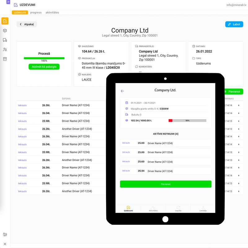
For those who don’t know, ERP stands for Environment Resource Planning, and the purpose of the app is to manage the resources, and resource flow of a company. In my case, the company is selling quarry resources (minerals) to their clients. There is one headquarters unit (browser app) and several quarries across the country (mobile app).
Technical requirements:
- Web app for the managers
- Mobile app with offline support for the quarry employees
- REST API server for communication between both apps
Workflow (apps business):
- The manager registers resources in the web app. Resource section: produce, quarries, categories, clients, trucks, drivers, etc.
- The manager creates a task for a particular quarry employee. Planning section: task, task progress
- Quarry employee prepares the produce based on the task requirements.
- Once the quarry produce is loaded, the task progress is registered on the mobile app (offline, online mode).
- The manager issues an invoice to the client for that particular load, and if the task is completed, marks it as done. The task disappears from the mobile app.
Everything sounds nice and easy, except for one thing - the offline mode. Frankly, in my 15 years of software development experience, I haven’t had a project where an app can go offline, and at any given time can come online (cellular data, mobile coverage zone) and sync with the server.
Meaning, quarry employees will register task progress on the mobile app with access to the REST API server.
Let me introduce you to The Outbox.
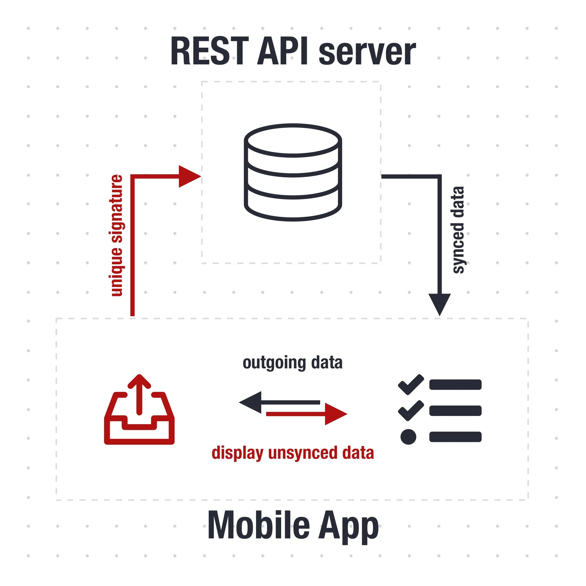
Sole purpose - keep the outgoing data (for POST payload) in some kind of storage, and when the app comes online, send it to the REST API server, synch everything.

Like in all development cycles, everything works in the development, but some features will fall apart with actual testing (production).
Here are some takeaways:
Give the user the feeling of control.
In the early stage of the outbox development, all data registered in the outbox didn’t appear anywhere on the app (no UI for that). The user didn’t know whether the data is saved at all, resulting in additional duplicate data add. It’s easy to miss this UX if you are developing the solution online, the outbox will synch data with the server and the app receives the registered data by the user.
Give some indication to the user in what mode is the app (online or offline).
This will avoid some unwanted UX, where the quarry employee will end up in conversation with the manager about the task status. I’ve added the last sync DateTime UI element to the app, and also the current status of the app (online/offline). The notification tab also helped the user to see the last changes in the task context.
Mark offline data with a unique signature.
In some use cases, the app made multiple duplicate records on the server once it came online. Dunno if it was because the user stressed and pressed the “sync” button, or the coverage wasn’t stable - didn’t receive the “201 - status created” response before it send another request. The solution - mark all requests with a unique signature, so the server will know when to create new, ones or when to update existing on (in some cases ignore).
Lessons learned:
Whether the app is online or offline, gives the user the feeling of control**. As much as you want to develop a clean app without extra unnecessary UI elements, make sure the user is aware of the background processes, especially those related to the user input.

