3D Modeling
Devlog #2: Adding Weight and Printing the Final Set
Touch and weight are the two things that separate a chess piece from a plastic toy.
Read storyA chess piece and a UI component have a common denominator: they should both be distinguishable and recognizable.
It was Christmas holiday season, and that meant it was time for a quick project. Inspiration came from my better half, as she said that there must be a chess set in every home.
I am huge fan of the Staunton chess set design, as to my taste it is the most elegant and timeless design. Rounded, simple, and yet with a lot of character. It is a “jag!” (English slang for Jaguar car) of all the chess sets. Here is the link to the Wikipedia article for more information about Staunton chess set.
FIDE is the international chess federation, and apparently they have a set of rules for chess piece design.
There are even rules towards the height and hierarchy.
King > Queen > Bishop > Knight > Rook > Pawn
Allowed height tolerance: +/- 10%
Another notable rule, is that FIDE does not prescribe an exact shape for each piece. It prescribes recognisability.
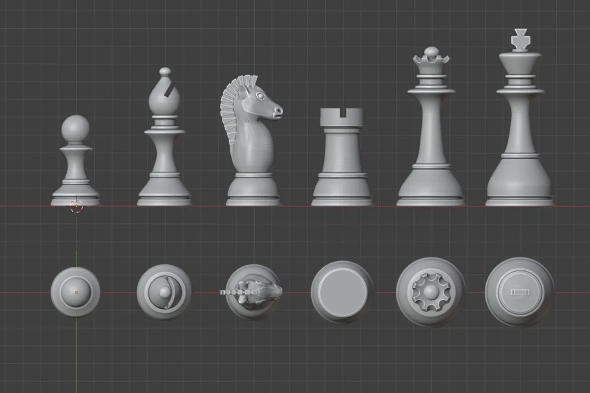
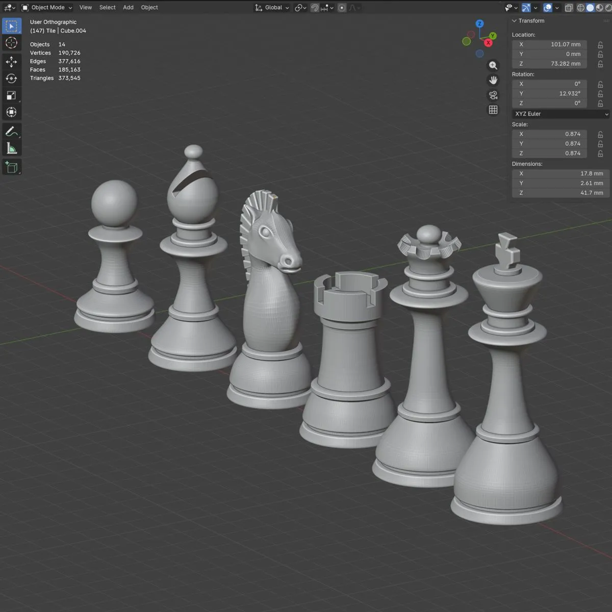
I slightly increased the height of the pieces. On top of that, the diameter varies from 29 mm to 40 mm, and the position of the first outer ring differs, depending on the piece value.
When working with distinctive shapes, I draw parallels with the UI button design. In UI design, important distinction should be communicated through multiple visual cues - such as shape, color, text, size, and underline. In chess piece design similar principles apply. There are multiple visual cues that help distinguish the pieces.
For example, bishop and rook are looking almost the same from the top view, but the slice and additional sphere on the top makes them distinguishable. The same goes for the king and queen, just by the feel of the top, you can distinguish them.

Written by EdgeLimits
Touch and weight are the two things that separate a chess piece from a plastic toy.
Read storyCheeks too big and it is a cow. Too small and it is a dog. Somewhere in between there is a horse, and it took me 8 hours to find it.
Read storyIt was time for the final, final step of the Shmulis project - painting and finishing. Let's celebrate it with new tools.
Read story