
Devlog #1: Designing the Knight (and Learning Horse Anatomy)
Cheeks too big and it is a cow. Too small and it is a dog. Somewhere in between there is a horse, and it took me 8 hours to find it.
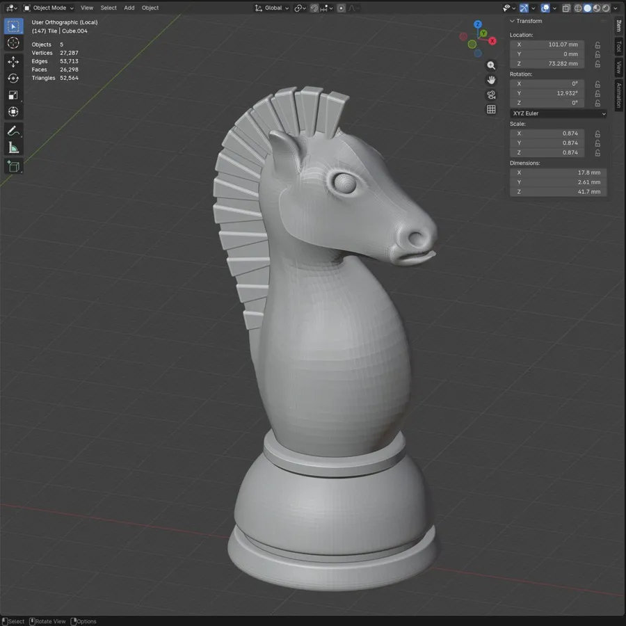
Designing the knight was the hardest piece in the whole set. Also, it felt that it was the most important piece to get right.
At first, I thought that I will try to design it so it can be printed without supports, and that would require the horse’s chin to be tucked in toward the neck. But I quickly realized that it was a bad idea, as designing a horse in the first place is hard enough. Adding extra complexity would extend this project way too much as I anticipated.
A shop trip that proved I couldn’t make it worse
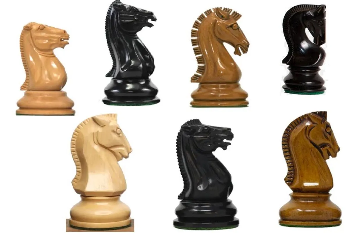
I went to a local shop that sells chess sets to see how other chess sets designed their knights. Reality check: if I can make the knight piece look like a horse, it will be good enough. As I cannot make it worse.
Learning horse anatomy so it doesn’t look like a cow
If you make the horse cheeks too big, it looks like a cow. If you make them too small, it looks like a dog. My goal was to make the knight a beefy, proud horse, with a stylish mane.
Reference images are your friend. Where the eyes sit relative to the nose, where the ears sit relative to the cheeks, how the mane flows — none of that is something you can guess.
I still think that I could have done a better job with the cheeks, but I was already 8 hours into the design, so I had to call it, as I wanted to finish the project before the Christmas holidays were over.

Written by EdgeLimits